Let’s say you’re working with real-world data. And in that data you’ve got the latitudes and longitudes of some entities. And more than that, you want to put those entities on a map and show it off to your friends. How would you do it?

Well, you’ve got a few options…
- Manually place points on a map using Google Maps, which is kinda okay when you have 2 or 3 entities but once you go over 10 it gets a little tedious right?!
- Use a library/package from some programming language that does it for you. Personally my favorite option 💃🏻
There are a few libraries out there for this, but today we’re going to talk about Folium.
Folium
The purpose of this library is to combine Python’s data manipulation power with the map visualization strength of the JavaScript library Leaflet. The idea here is to make it even easier to plot points on a map.
Where’s the code?
All the code I’m going to show below is neatly organized in this GitHub repo. It has the environment setup instructions both with docker and without docker.
Installation
Start by setting up the environment:
|
|
With docker
If you like the 🐳:
|
Without docker
If you’re not into the 🐳:
|
|
Getting started
After that, still in the terminal:
With 🐳:
|
or without docker:
|
Once you run one of the commands above, you’ll see a message like this one in your terminal:

The last line shows the access token, just copy it and paste it in your browser to open jupyter. Something like this should show up for you:

If you run the folium_intro.ipynb notebook end to end, you’ll get the same results I’m going to show here. Also, if you click on the map images that follow, you’ll be taken to those maps’ pages so you can interact with them 😉
Hands on

We start by importing the necessary libraries and creating a map:
|
|
|
|
|
|
|
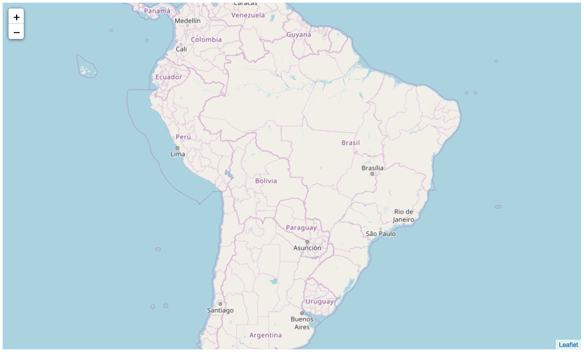
folium.Map() only needs the location parameter to create your map. This parameter takes a latitude-longitude pair that can be a list or a tuple. Here I also passed a value (4) for the zoom_start parameter. The default of this parameter is 10, but a zoom of 10 doesn’t keep the whole country in view, so, the new value of 4. When we call the map, we get:
|
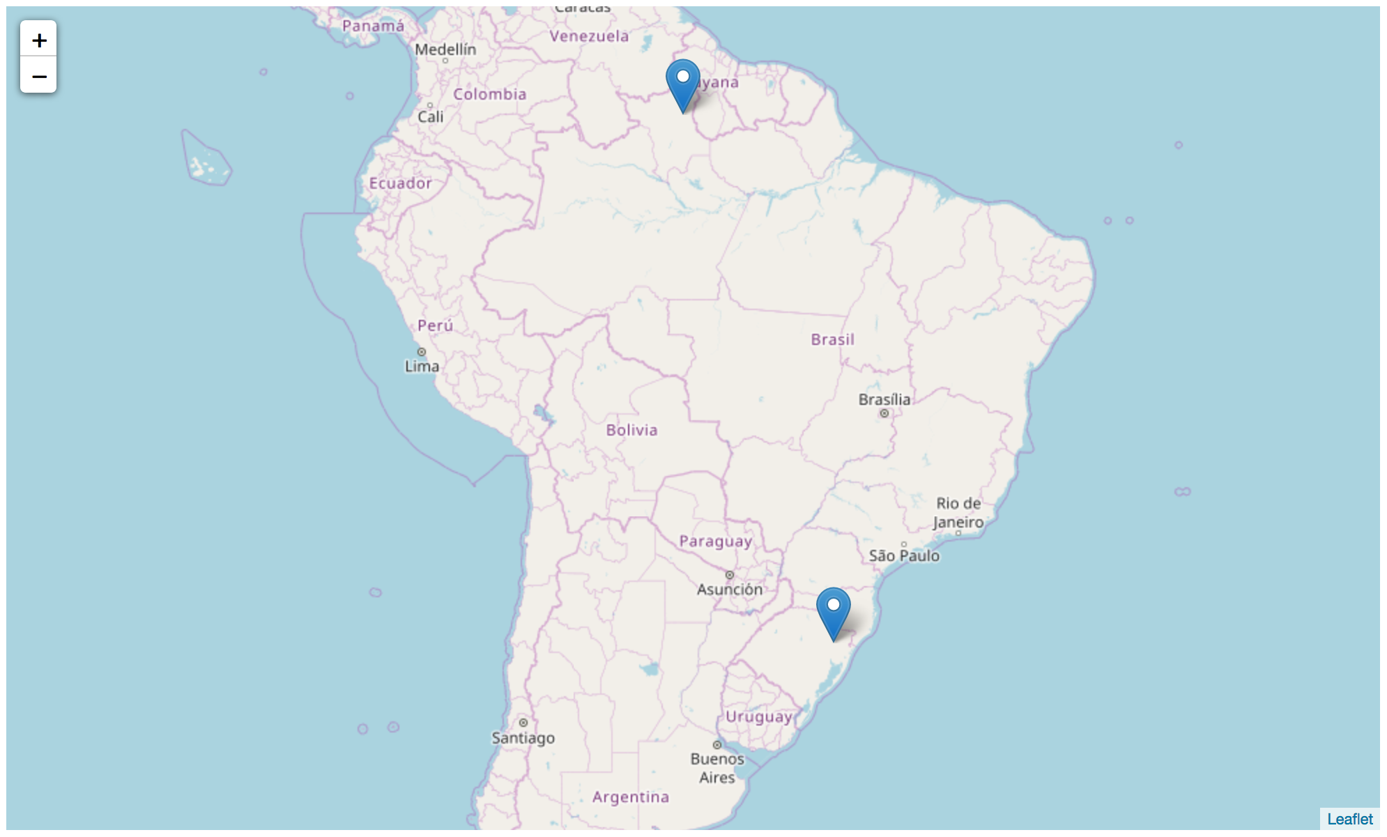
But now I want to add pins to the map. Here I’ll use as an example a dataset with the geolocations of companies that showed up in the expense reports analyzed by Operação Serenata de Amor. In the intro-folium repo there’s a reduced version of this dataset. So let’s start by reading the data and adding the first two companies to the map:
|
|
|
|
|
|
|
|
|
|
|
folium.Marker() places a location “pin” on the map. For that to work we need to pass in location again and also indicate which map to add the pin to using the add_to() method. Calling the map again, we get:
|
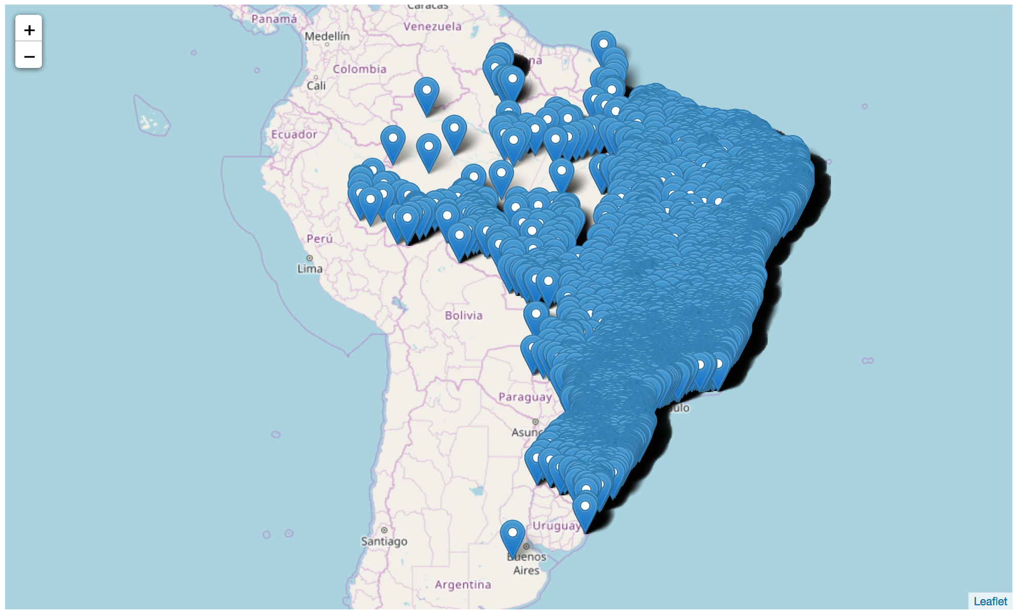
Resist the curiosity of putting all the companies on a map. With more than fifty thousand companies in this dataset, it’ll probably crash your computer (it crashed my jupyter). Trust me, a map with all the companies in the dataset looks like this:
Knowing that showing off the beauty above crashes your computer, let’s just pick one state to show:
|
To improve the visualization I also started a new map, this one with the coordinates of Pernambuco state (my home state ❤️), see:
|
|
|
|
|
|
And putting the companies on the map:
|
|
|
|
|
|
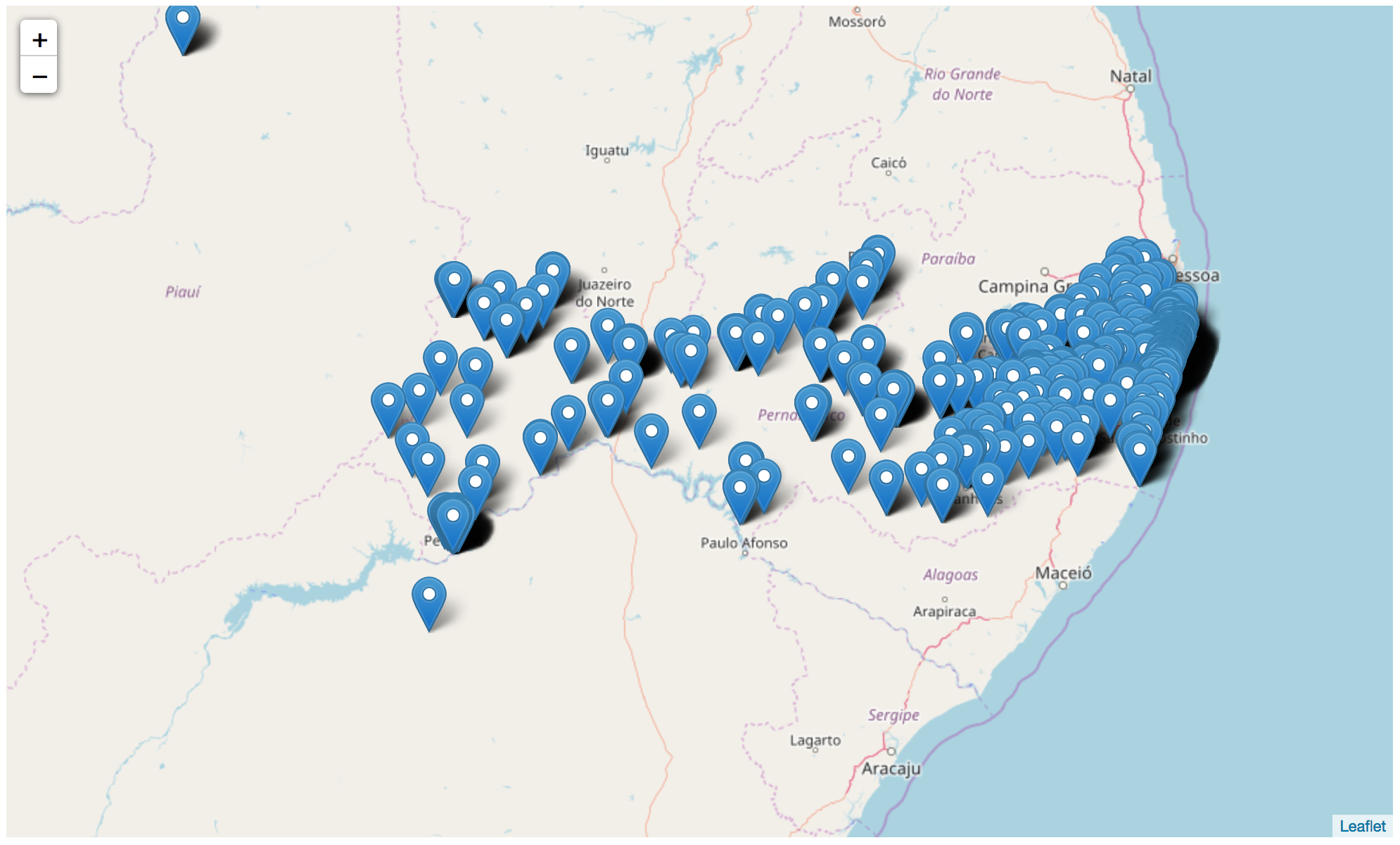
Here we can already notice something worth analyzing: even though the dataset shows them registered as Pernambuco, we find two companies whose latitude and longitude aren’t within the state boundaries 🤔
Cool, but a little bland right? So let’s take a look at how to color things up a bit?
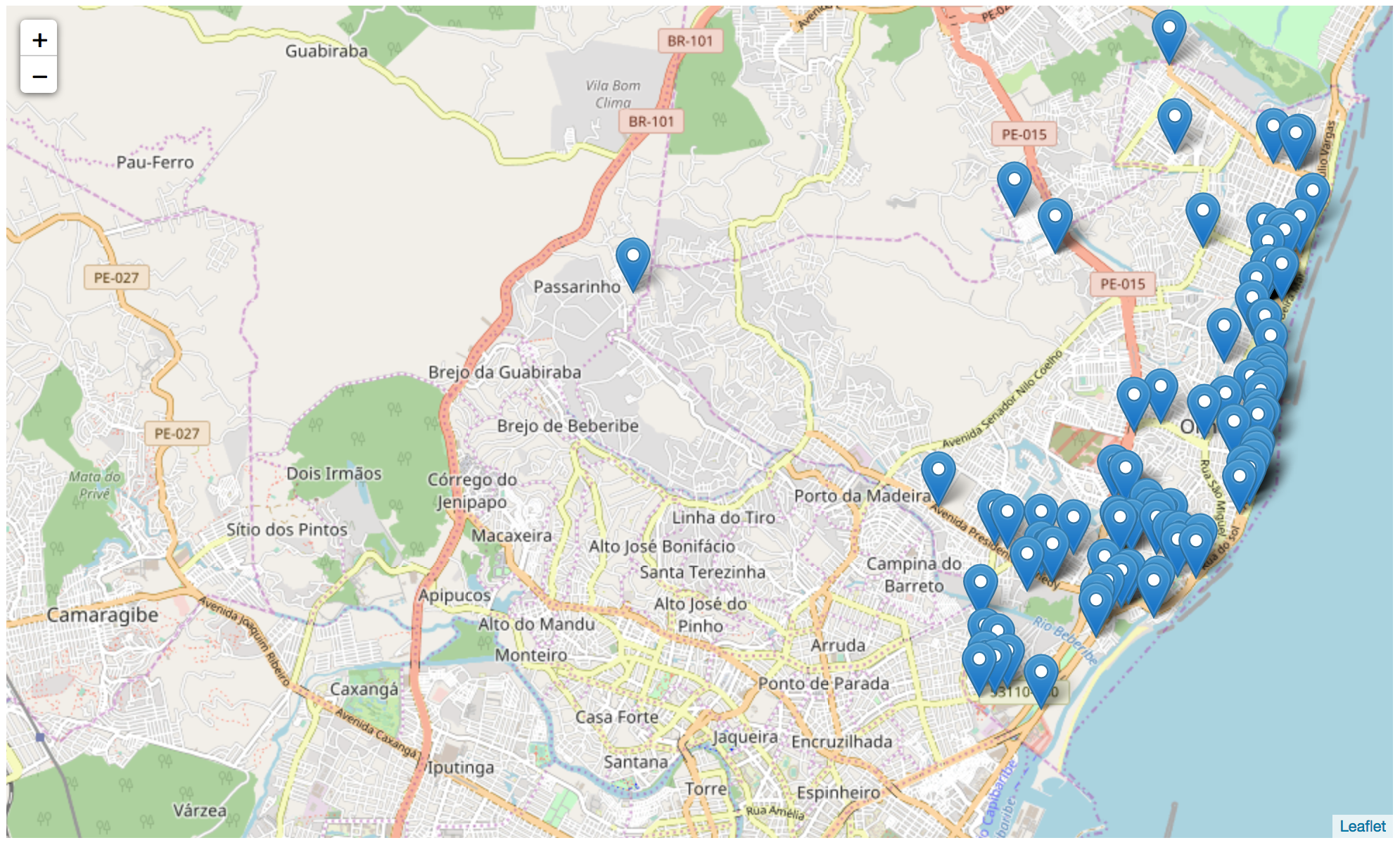
Let’s start by reducing our number of companies even more. I picked the 110 companies from Olinda ❤️, and put them on the map:
|
|
|
|
|
|
|
|
|
|
|
|
|
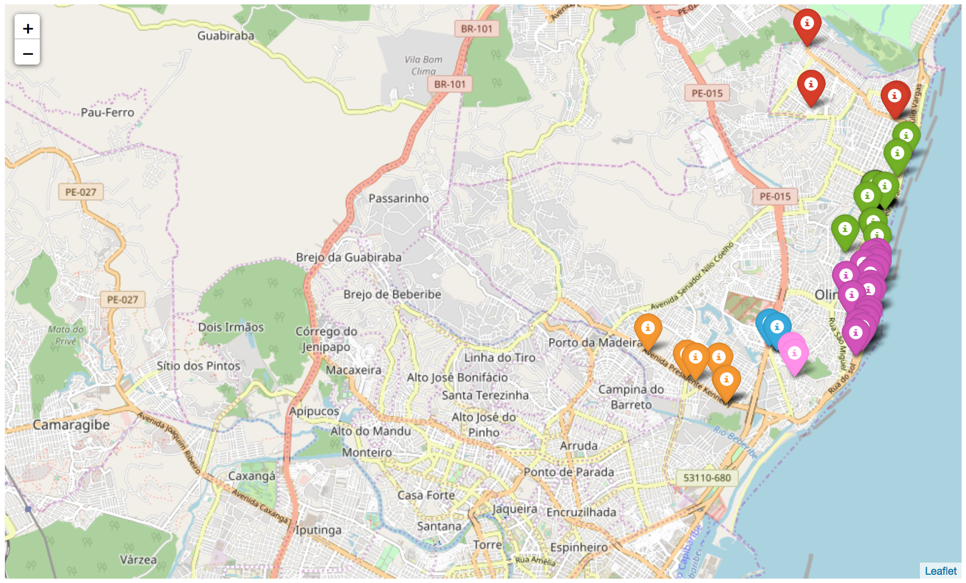
Then I picked some of the 22 neighborhoods with companies to color, creating a dictionary that maps a neighborhood name to a color:
|
|
|
|
|
|
|
|
|
|
|
|
|
|
|
|
|
|
|
|
Here we used a new parameter of folium.Marker(), the icon, which takes a folium.Icon object and thus the coloring we want. Note that, before putting the points on the map, I clear the Olinda map by recreating the object so I don’t end up putting colored pins on top of the old map with the blue pins. One more detail: this type of marker (that looks like a 📌) follows the bootstrap colors, so it’s limited, but for this example it works:
|
Three little extras
Maps on web pages
You can save your maps as HTML pages using the command below. Just identify the map you want to save, use the .save() method and pass a filename as a parameter. All the map pages in this post were generated this way:
|
Extra info on a map
You can also pass information about the entity you’re placing on the map using the popup parameter. This way, when you click on one of the pins, a balloon shows some info:
|
|
|
|
|

A rainbow
As I said before, folium.Marker() has limited colors, so if you need more colors, or if you need different colors from the ones available, use either folium.CircleMarker() or folium.PolygonMarker(). Both accept color hashes.
So, are you going to make some maps too? 😉
Fun facts and tips
Open maps (and data)
Leaflet, and by consequence Folium too, uses OpenStreetMap to build its maps. OpenStreetMap maps are open and built by a community of people interested in maintaining and helping the project. For example, if you find any errors somewhere on the map you can submit corrections. I recommend taking a peek at the OpenStreetMap Wiki for more info.
df.iloc[i]
A way to view any row of the dataframe as a nicely formatted print, just pass the row index as i.
df.iterrows()
Very useful for iterating through the rows of a dataframe one by one. This method always returns an index and the corresponding row.
Links
- A summary of pandas tips: Lelê Portella’s Pandas cheatsheet
- WebApp to help pick a color set: ColorBrewer2 (thanks Geremia 😉)
- What to do when you have too many points? Filipe’s tip (thanks 😉) was to use a folium plugin called
MarkerCluster
