How to define the optimal number of clusters for KMeans
Leia esse texto em Português na Revista do Pizza.
One of the most famous methods to find clusters in data in an unsupervised way is using KMeans. But what do we do when we have absolutely no idea how many clusters the data is going to form? We can’t just guess.
Discovering the number of clusters is a challenge especially when we are dealing with unsupervised machine learning and clustering algorithms. To solve the issue of “how many clusters should I choose” there’s a method known as the Elbow Method.
The idea is pretty basic: define the optimal amount of clusters that can be found even though we don’t know the answer in advance. Seems like magic, doesn’t it? But I promise you it isn’t.
The code that I’m going to use from now on can be found in this GitHub repository.
So to begin, we need data! We will use the Iris dataset. There’s a genre of flowers called Iris, it is a group of around 300 flower species with different petal and sepal sizes. Biological curiosity aside, the dataset is used to demonstrate how machine learning and clustering algorithms work a lot. I mean A LOT!
This dataset holds 150 samples of three Iris species (Iris setosa, Iris virginica and Iris versicolor) that even though are very similar, are distinguishable using a model developed by the biologist and statistician Ronald Fisher.
This dataset is so widely used that data science libraries usually have it built-in so it can be used in demonstrations and examples. Let’s take a peek at the first lines of our dataset, to start we need to import it, I prefer the version that comes in the seaborn library:
    import seaborn as sns
    iris = sns.load_dataset('iris')
Glancing at the first 5 rows of our dataset you might ask me: “But Jess, the answers were are seeking is right there in the _species_ column, weren’t we going to do unsupervised clustering?”

First 5 rows of the Iris dataset, the result of the `iris.head()` command
Okay, yes! We have the answers in our dataset but for the purpose of this tutorial, we are going to forget that we already know the species of our samples and we are going to try to group them using KMeans.
KMeans
If you aren’t familiarized with KMeans yet, you must know that to use this method you’ll need to inform an initial amount of clusters before you start. Thinking of the version implemented in scikit-learn in particular, if you don’t inform an initial number of clusters by default it will try to find 8 distinct groups.
When we don’t know how many clusters our samples are going to form we need a way to validate what is being encountered instead of just guessing.
The elbow method
And that’s where the Elbow method comes into action. The idea is to run KMeans for many different amounts of clusters and say which one of those amounts is the optimal number of clusters. What usually happens is that as we increase the quantities of clusters the differences between clusters gets smaller while the differences between samples inside clusters increase as well. So the goal is to find a balance point in which the samples in a group are the most homogeneous possible and the clusters are the most different from one another.
Since KMeans calculates the distances between samples and the center of the cluster from which sample belongs, the ideal is that this distance is the smallest possible. Mathematically speaking we are searching for a number of groups that the within clusters sum of squares (wcss) is closest to 0, being zero the optimal result.
Using scikit-learn
Scikit-learn’s KMeans already calculates the wcss and its named inertia. There are two negative points to be considered when we talk about inertia:
- Inertia is a metric that assumes that your clusters are convex and isotropic, which means that if your clusters have alongated or irregular shapes this is a bad metric;
- Also, the inertia isn’t normalized, so if you have space with many dimensions you’ll probably face the “dimensionality curse” since the distances tend to get inflated in multidimensional spaces.
Now that you are aware of all that, let’s look at our data: we have only 4 dimensions - length and width of petals and sepals, let’s use the elbow with our data, shall we? I wrote a function that receives a dataset as input and calculates the KMeans for 19 different amounts of clusters ranging from 2 to 20 possible groups and finally returns a list with our wcss:
    def calculate_wcss(data):
        wcss = []
        for n in range(2, 21):
            kmeans = KMeans(n_clusters=n)
            kmeans.fit(X=data)
            wcss.append(kmeans.inertia_)

        return wcss
When we use the function written above to calculate the within clusters sum-of-squares for our Iris dataset and plot the result, we find a plot like this:
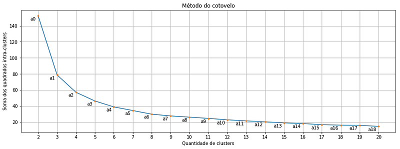
Each orange point is a cluster quantity, note that we start in two and go up to 20 clusters. And there where we might get the first doubt: Which of these points is exactly the optimal cluster amount? Is it the point a2 or a3 or even the a4?
May math save us all
What if I told you that there’s a mathematical formula to helps us out?

It turns out that the point that indicates the balance between greater homogeneity within the cluster and the greater difference between clusters is the point in the curve that is most distant of a line drawn between points a0 and a18. And guess what! There is a formula that calculates the distance between a point and a line! And it is this one below:

Formula that calculates the distance between a point and a line that passes through P0 and P1
Don’t be scared, in this case, P0 is our a0 and P1 is our a18:
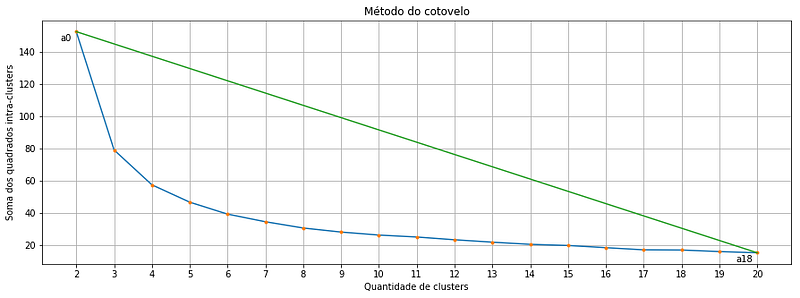
and the pair (x,y) represents the coordinates of any point that we might want to calculate the distance to the line. Let’s look at our elbow plot one more time:
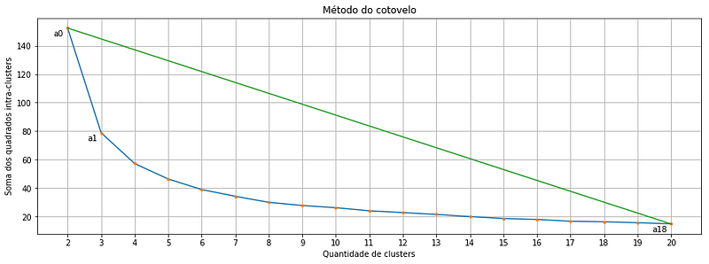
Suppose we want to calculate the distance between the point a1 and the line that passes through a0 and a18, here is the data we need:
Substituting the values above into the distance formula we have the following:


Math and Python, the power couple everyone loves
I imagine you agree with me when I say “No one deserves to calculate all of this by hand”. So let’s use a method for that. In short, we are just going to transcribe the formula that calculates the distance between a point and a line to code, the result is something like this:
The method optimal_number_of_clusters() takes a list containing the within clusters sum-of-squares for each number of clusters that we calculated using the calculate_wcss() method, and as a result, it gives back the optimal number of clusters. Now that we know how to calculate the optimal number of clusters we can finally use KMeans:
    import seaborn as sns

    from sklearn.cluster import KMeans


    # preparing our data
    iris = sns.load_dataset('iris')
    df = iris.drop('species', axis=1)

    # calculating the within clusters sum-of-squares for 19 cluster amounts
    sum_of_squares = calculate_wcss(df)

    # calculating the optimal number of clusters
    n = optimal_number_of_clusters(sum_of_squares)

    # running kmeans to our optimal number of clusters
    kmeans = KMeans(n_clusters=n)
    clusters = kmeans.fit_predict(df)
Comparing before and after
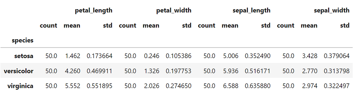
After clustering the data we should take a look at the statistical description of each cluster:
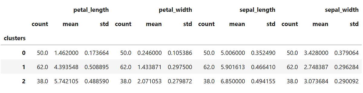
Not bad if compared to the statistical description of the original data that I show below, right?
Conclusion
Obviously, no clustering will be 100% accurate especially when we have clusters that present very similar characteristics. I particularly like the visual version of a good clusterization. Let’s put two petal features in the plot and color the points based on the cluster each sample was given and also based on the species they belong to:
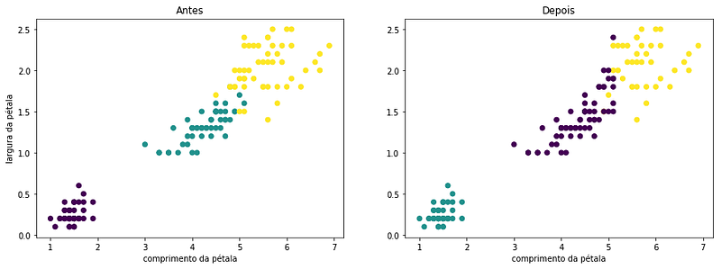
We can see in the plot those 12 observations that “migrated” in classification could easily be a part of any of the two clusters.
Is also worth mentioning that the elbow method isn’t the only way to infer the optimal cluster amount. There’s also a method that uses, for instance, the silhouette coefficient. But today, that’s all folks.
xoxo and good clusterization.
Extra reading
- The article comparing the Ward method and the K-mean in grouping milk producers (in portuguese). In the third topic, there’s a great explanation of clustering methods.
- One article in Wikipedia that explains in great detail the method to calculate distances from where I copied the formula that I should earlier.
- There are slides from Professor André Backes class on clustering (in Portuguese).
- The code that I used in this post can be found in this GitHub repository.